
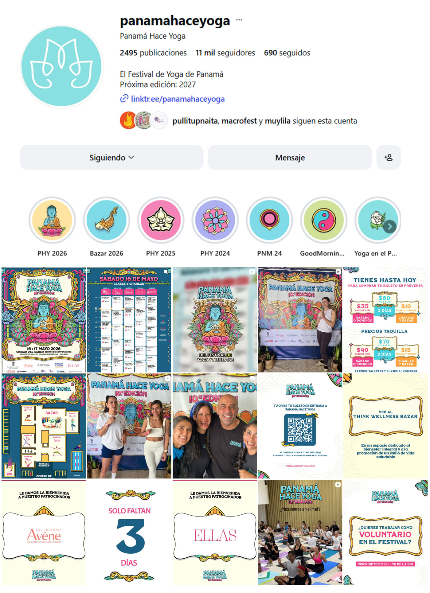
I created the official artwork for the Panama Hace Yoga 2026 festival. The visual identity was designed to celebrate the festival's 10th anniversary while capturing the spirit of the event and the culture of Panama.
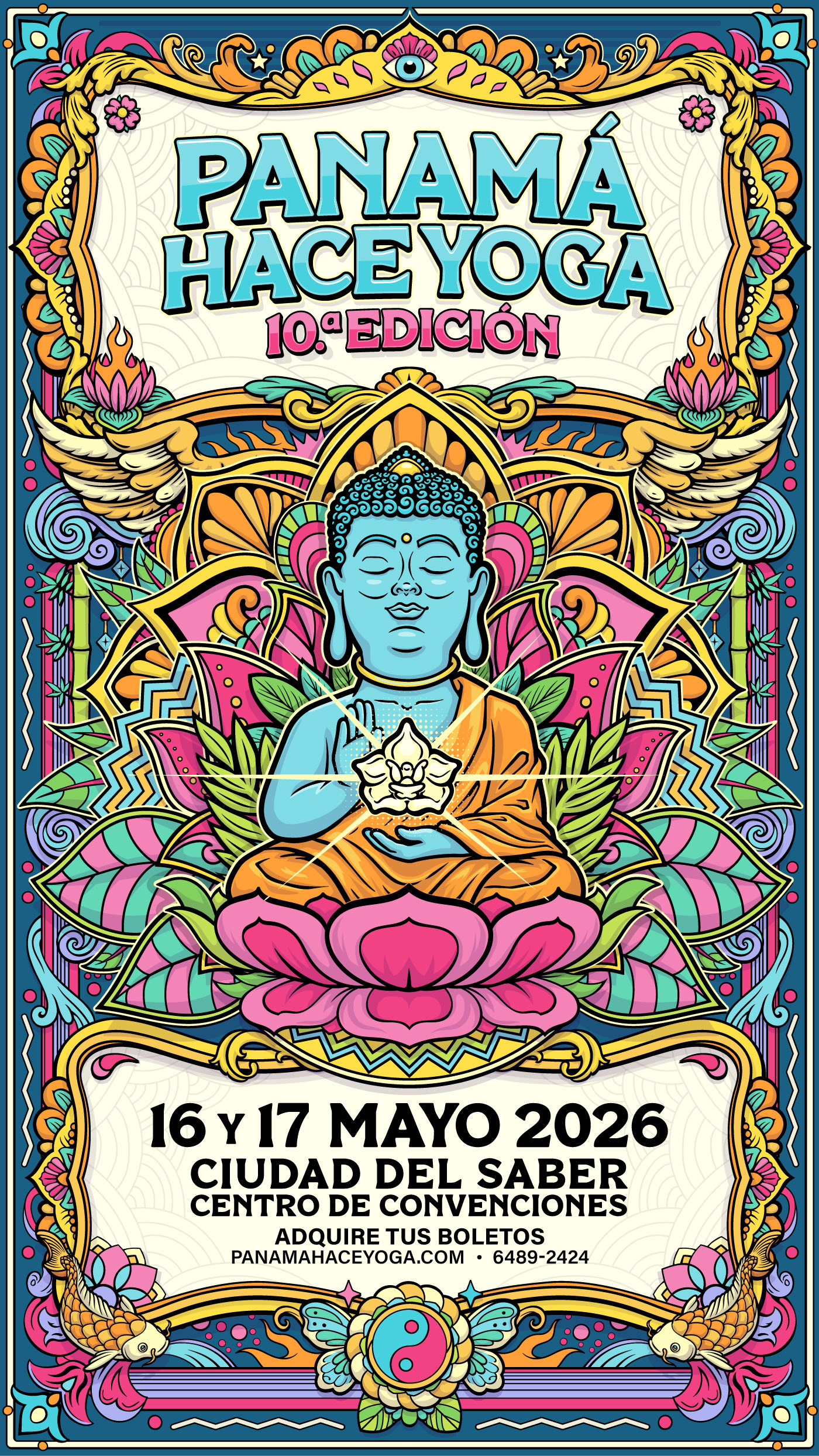
Like any successful festival branding, the artwork was built as a flexible visual system that can be easily adapted to multiple formats and sizes.
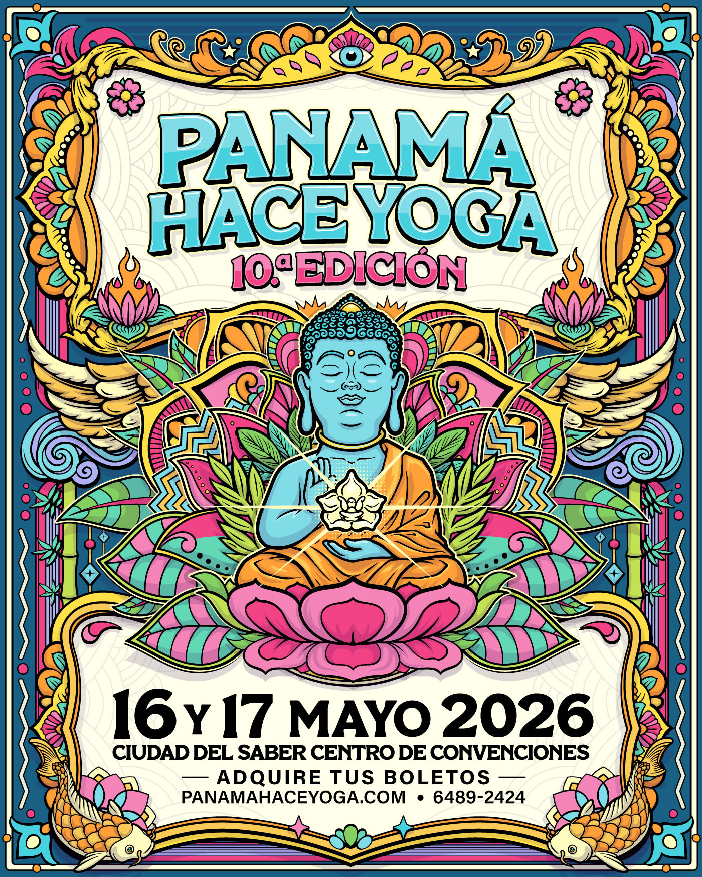
It was also designed to work seamlessly across merchandise and promotional materials.
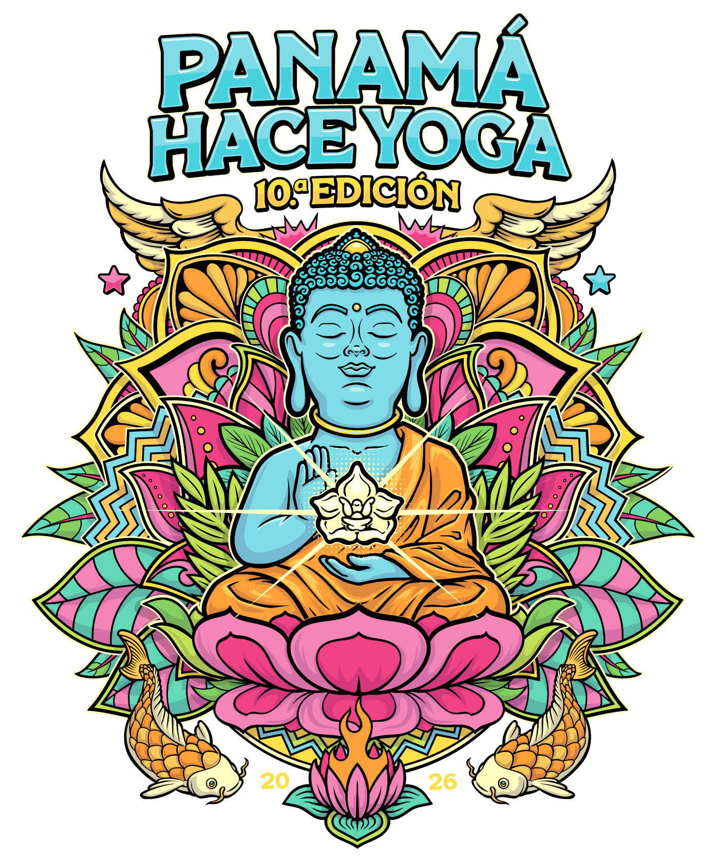
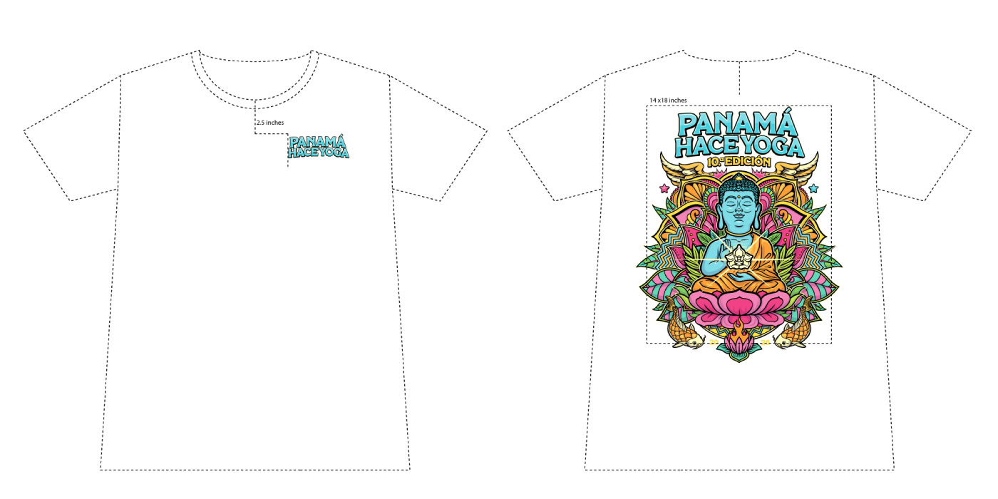
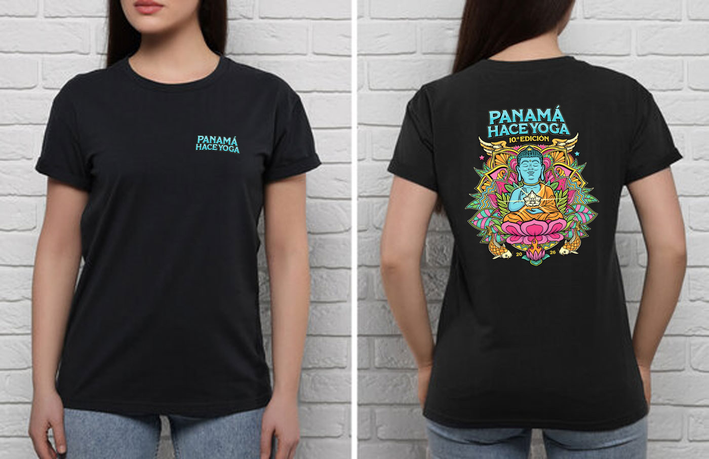
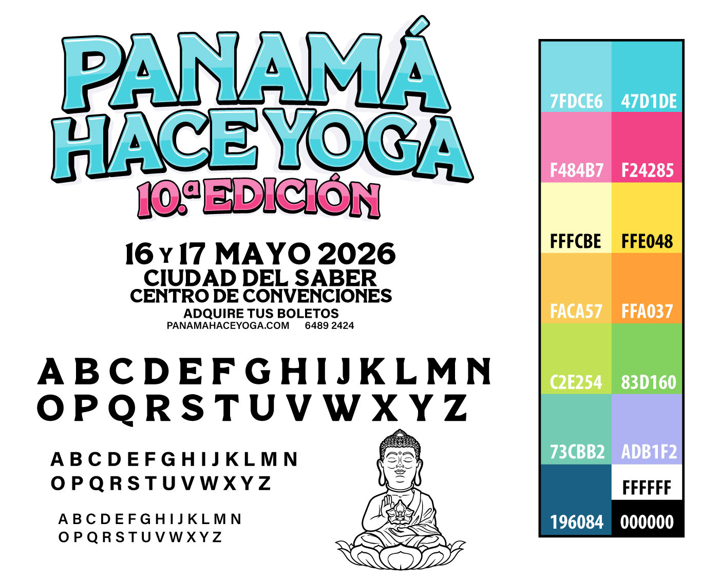
The final delivery included the typography files, logo, illustrated elements, and the complete color palette with color codes, making it easy to develop the event website and any additional marketing assets while maintaining a consistent visual identity.
To ensure an efficient workflow, the master artwork was carefully organized with clean, grouped layers, allowing every element to be rearranged or repurposed quickly for new applications. This makes it possible to create new assets in a fast and organized way without rebuilding the design from scratch.
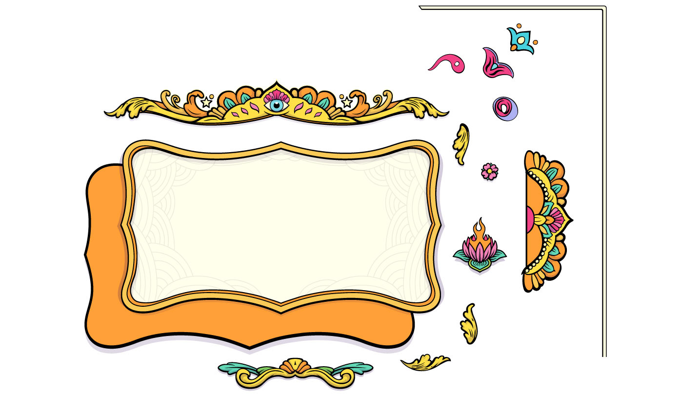
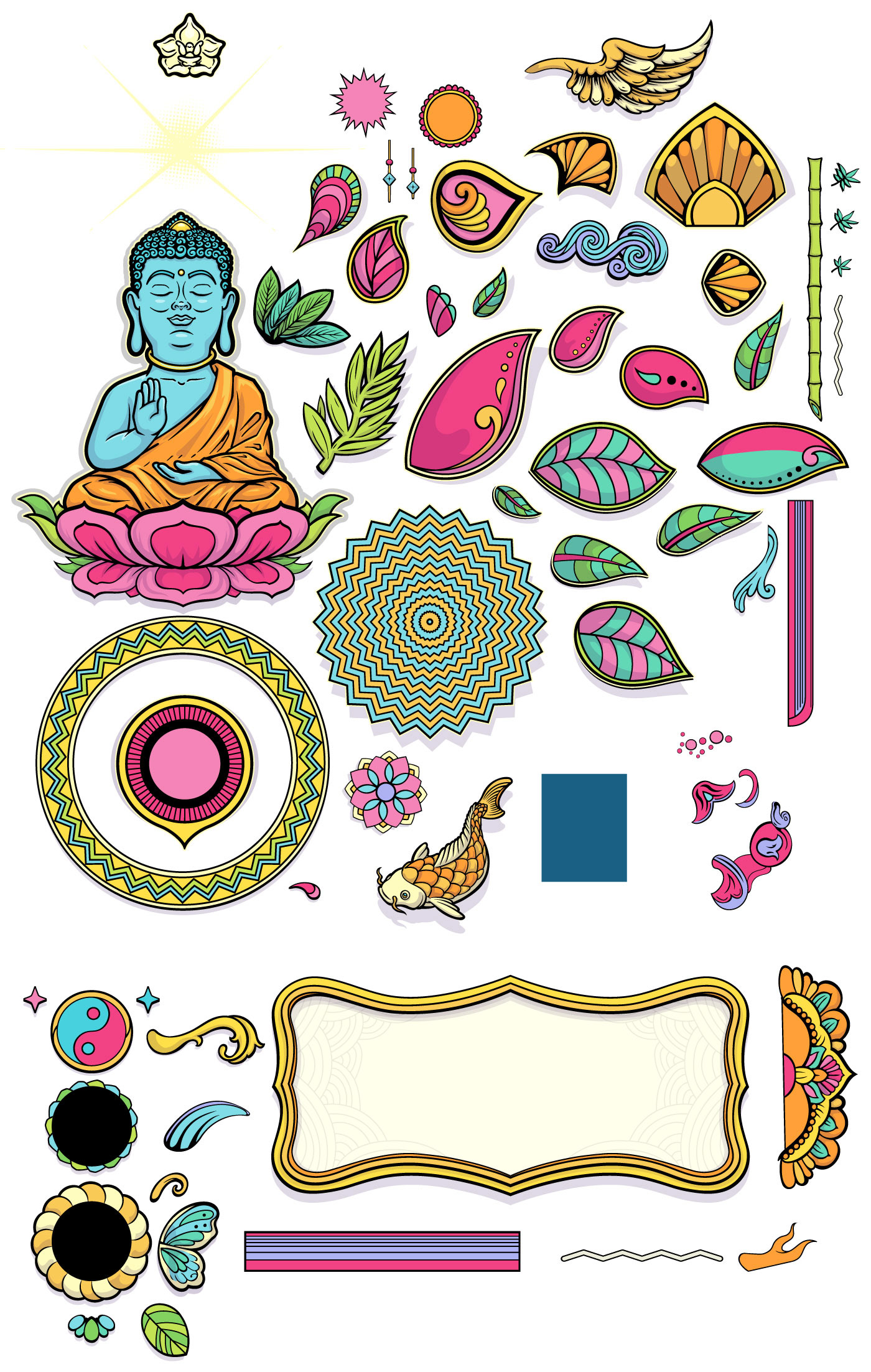
Below are some examples of how this visual identity can be adapted across different formats and applications.
Thank you!